Guide
Fern and Foliage Patterns: A 2026 Designer's Guide to Foliage-First Botanicals
# Fern and Foliage Patterns: A 2026 Designer's Guide to Foliage-First Botanicals Something quiet has happened to botanical surface design over the past eighteen months. The flower, which has anchored the category for two centuries, has been demoted. The leaf has taken its place. This is not a rejection of florals. It is a shift in where the eye is asked to rest. Instead of a peony at full bloom carrying the pattern, the structure now comes from the stem, the frond, the unopened bud, the clover. Trend Bible names this directly in its 2026 perennial print direction, noting that patterns are "placing focus on the leaves and stems of florals rather than the flower itself" (Trend Bible). It is a small change in emphasis with large consequences for how a pattern tiles, how it scales, and how easily a customer can live with it. For anyone designing or licensing seamless patterns this year, foliage-first work is worth understanding properly. It behaves differently from floral work at almost every stage, and the differences are the reason it is selling.
Why the Flower Lost Its Job
The clearest signal comes from the people specifying wallpaper for real clients. Apartment Therapy asked five interior designers what was on its way out for 2026, and bold, large-scale florals came up repeatedly. New York designer Lara Apelian described big blooms as conjuring "grandmom's attic vibes," while Austin designer Killy Scheer noted that "large floral wallpapers can dominate spaces and feel visually chaotic" (Apartment Therapy).
Scheer's proposed replacement is the sentence to pin above your desk: "restrained botanicals. Stylized foliage or smaller scale graphic florals, which make it easier to layer in other patterns, textures, and elements."
That last clause is the commercial argument. A room is rarely one pattern. It is a wallpaper, a cushion, a curtain, a lampshade. A dominant floral makes every other decision harder because it insists on being the loudest thing present. Foliage does not insist. It reads as texture from across a room and as detail up close, which means it can sit underneath other patterns rather than competing with them. Designers are choosing it because it makes the rest of the scheme possible.
Ferns Have Done This Before
Foliage-first design is not new, and knowing its history gives your work better reference points than a mood board of contemporary competitors.
Between roughly 1840 and 1890, Britain went through a genuine mania for ferns. The term pteridomania was coined in 1855 by Charles Kingsley, and the craze reached well beyond horticulture into every decorative surface available. Fern motifs appeared on rugs, tea sets, garden benches, chamber pots, and, memorably, the custard cream biscuit, whose fern-scrolled tooling survives to this day (Historic UK).
What makes that period useful now is the vocabulary it produced. Victorian fern design was not naturalistic illustration. It was highly stylized: the frond flattened into a repeating scroll, the pinnae simplified into rhythmic notches, the whole form treated as a linear device rather than a portrait of a plant. That reduction is exactly what a good seamless tile needs. If you are stuck on how to abstract a leaf without losing its identity, the nineteenth century solved it already, and the solutions are out of copyright.
The other lesson is about restraint at the source. Pteridomania stripped native ferneries in Britain and Australia to feed collectors. The motif thrived; the plant did not. A footnote worth carrying into a category that now runs on digital files rather than harvested specimens.
The Wellbeing Argument Is Real, but Be Precise About It
Foliage patterns are frequently sold on wellbeing claims, and the underlying research is stronger than most marketing copy suggests, though it does not say quite what the copy implies.
A 2025 systematic review in Frontiers in Physiology examined biophilic interventions in confined settings such as hospitals, eldercare facilities, and habitat modules. It found that plants, natural light, and natural elements reduced stress, improved mood, and supported recovery, with results consistent with Stress Reduction Theory and Attention Restoration Theory (Frontiers in Physiology).
Note what that evidence covers: actual plants, actual daylight, actual natural materials. It does not establish that a printed fern lowers cortisol. The honest position for a designer is that representational nature is a design strategy aligned with a well-supported principle, not a clinical intervention. Say that, and you sound like someone who has read the research. Overclaim, and any specifier who has read it will discount everything else you say.
If you want the fuller treatment of nature-led surface design and where the evidence sits, our guide to biophilic floral patterns covers the framework in more depth.
Getting the Scale Right
Foliage forgives less than florals do at the wrong scale, because leaf forms are directional and the eye reads direction faster than it reads shape.
A useful working range:
Small scale, motifs under two inches. Reads as texture. Best for stationery, packaging, book cloth, and any surface viewed at arm's length. At this size the individual leaf disappears and you are effectively designing a tone.
Medium scale, roughly two to six inches. The commercial sweet spot for cushions, quilting cotton, lampshades, and children's textiles. The leaf is legible but not dominant.
Large scale, six inches and up. Wallpaper and upholstery territory, and where the current appetite for immersive schemes lives. Apartment Therapy's designers report scenic murals and wallpaper drenching as the incoming trends, with wallpapered ceilings treated as the fifth wall. Large foliage suits this better than large florals precisely because it holds the eye without stopping it.
The directional trap: ferns, palm fronds, and most stems have an obvious up. Tile them in a straight repeat and the eye will find the seam within seconds because every motif points the same way. Rotate motifs across the tile, use a half-drop, or build in deliberate counter-direction. Test at 25 percent zoom across a four-by-four grid before you commit, because at 100 percent every repeat looks fine.
Palette: Warm Greens, Not Cold Ones
The green in 2026 foliage work is not the cool, blue-leaning green of the mid-2010s. Colour forecasting has moved decisively toward warm, grounded, mineral-derived tones. Pattern Weaver's 2026 trend read describes earth palettes as spanning mineral tones such as slate blue and iron oxide red, clay tones such as terracotta and sienna, and "botanical greens that lean warm rather than cool," with the connecting logic that "every color feels like it could come from a natural material rather than a chemical lab" (Pattern Weaver).
Practically, that means olive rather than emerald. Sage rather than mint. Moss, khaki, and bronze-green rather than anything with a blue cast. Ground them on cream, oatmeal, clay, or warm charcoal rather than optical white, which will make any green look synthetic.
Keep the count low. Four to six colours is plenty for a foliage repeat, and a restricted palette is what allows a customer to layer the pattern with a stripe or check without the room falling apart. That layerability was the whole point.
Where Foliage Patterns Sell Best
Some categories take foliage more readily than florals, and it is worth knowing which before you build a collection.
Packaging and branding. Foliage carries botanical and natural cues without gendering the product, which matters for skincare, tea, candles, supplements, and anything targeting a mixed audience. A fern border reads considered; a rose border reads feminine, whether you intended that or not.
Stationery and book design. At small scale, foliage produces beautiful endpapers, jacket textures, and notebook covers where a floral would look busy.
Nursery and children's textiles. Trend Bible flags clover and greenery motifs moving into "unapologetically bold and playful" territory for baby and kids ranges, shifting away from the delicate cottage-style interpretations of previous years.
Hospitality and commercial interiors. Foliage patterns survive the long specification cycles that kill trend-led florals. A restrained fern wallcovering installed this year will still look deliberate in 2031.
Apparel. Small-scale foliage works on shirting, linings, and scarves where a floral would read costume. For the case in favour of the smallest scales, our guide to ditsy floral patterns for fabric covers the mechanics of tiny repeats in detail.
Building a Coordinated Foliage Collection
Single patterns sell. Collections sell more, because a buyer specifying a room needs three or four surfaces to agree with each other.
A workable structure: one hero at large scale carrying the full motif vocabulary. One supporting pattern at medium scale using a subset of the same forms. One texture at small scale that reads as near-solid. One non-botanical geometric, typically a stripe or an irregular check, drawn from the identical palette.
The palette is the binding agent, not the motif. Buyers coordinate by colour first and subject second, and a collection where all four surfaces share exact hex values will out-sell four beautiful patterns that happen to sit near each other.
Where to Start
Foliage-first botanicals are a rare case of a trend and a commercial fundamental pointing the same direction. They are what specifying designers are asking for, they layer better than florals, they hold up across long product cycles, and they suit the warm, grounded palettes that colour forecasting has settled on for the rest of the decade.
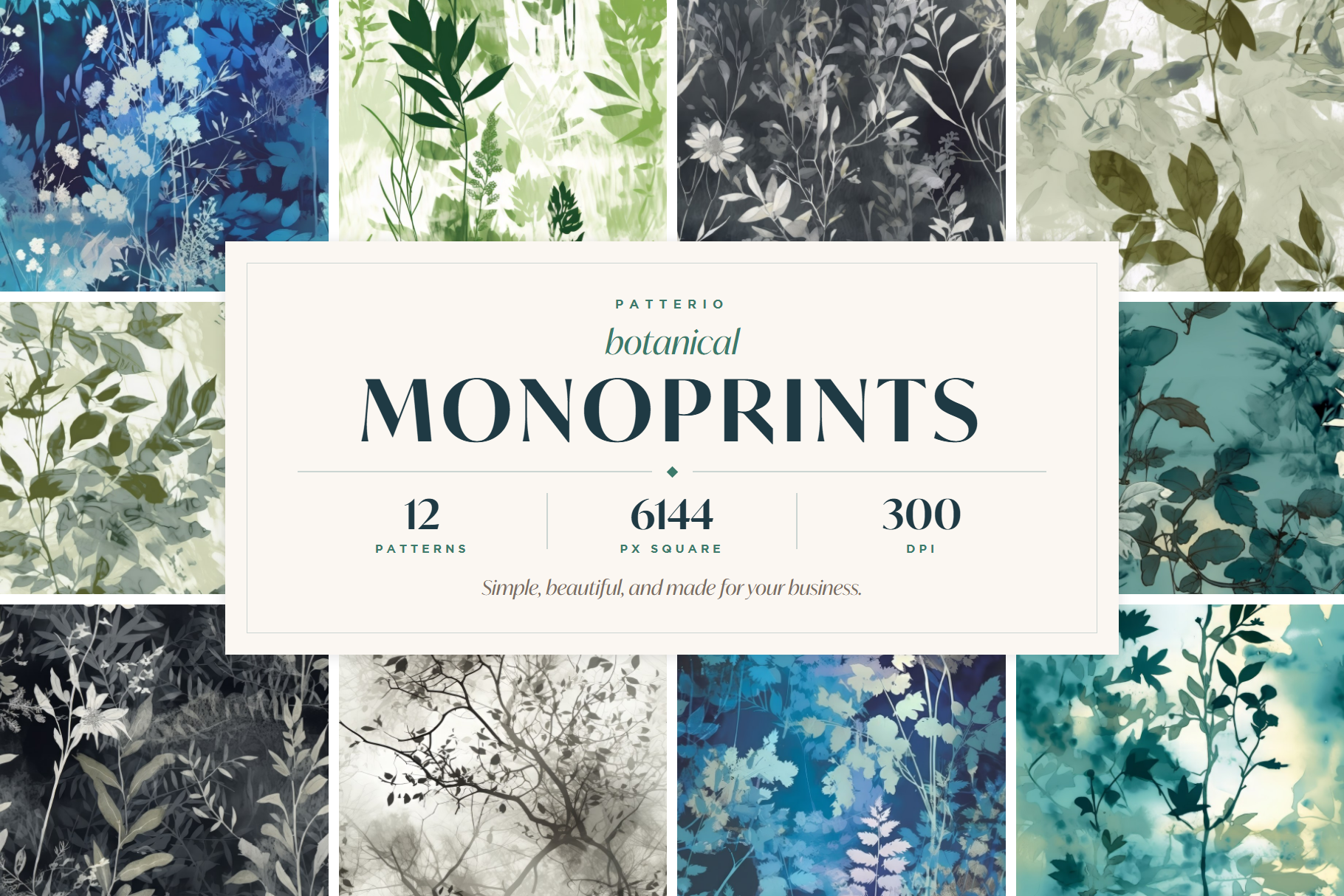
The Patterio botanical collection is built around exactly this thinking: soft, delicate, foliage-led repeats in warm greens and grounded neutrals, supplied as seamless tiles at print resolution with clear commercial licensing. Every set is designed to coordinate rather than compete, which is the whole argument for foliage in the first place.
Start with a hero, build the texture that sits under it, and let the leaf do the work the flower used to.
Ready to start?
Browse seamless pattern bundles