Guide
Biophilic Floral Patterns: A 2026 Designer's Guide to Nature-Led Surface Design
# Biophilic Floral Patterns: A 2026 Designer's Guide to Nature-Led Surface Design Biophilic design has moved past the houseplant moment. After several years of styled monstera shots and planter walls, the designers shaping 2026 interiors are working with a quieter, more structural version of the same idea: bringing the visual language of the natural world into rooms through pattern, color, texture, and form rather than through literal foliage. Biophilic floral pattern is the surface-design expression of that shift, and it is showing up across wallpaper, textile, packaging, and stationery in ways that earlier botanical trends did not. This guide is for designers, brand owners, and small studios choosing seamless patterns for spaces and products in 2026. It covers what biophilic floral actually means as a design direction, why it is breaking through this year specifically, how the visual vocabulary differs from earlier botanical trends, and how to source patterns that read as considered nature rather than wallpaper-aisle floral.
What Biophilic Floral Actually Means
Biophilic design is the practice of building human connection to nature into the structure of a space, not as decoration on top of it. The Style Sourcebook's 2026 biophilic forecast describes the discipline as design that "intentionally targets visual comfort with softened light, natural movement, and warm materials," anchored in "tactile richness through natural finishes that create grounding sensory cues" (Style Sourcebook). At the surface-design level, biophilic floral pattern is the printed expression of those same principles.
Three things separate a biophilic floral from a standard floral pattern. The first is reference to real botanical structure: motifs are drawn from the shapes of actual leaves, vines, branches, fungi, or root systems, not generic flower shapes. The second is biomorphic asymmetry: the composition follows the irregular, flowing logic of natural growth rather than gridded repeats or symmetrical rosettes. The third is restrained color: the palette pulls from earth pigments rather than dye-house brights, with the goal of feeling grounded rather than decorated.
A pattern can be floral without being biophilic, and a pattern can be biophilic without including a single recognizable flower. The category is defined by intent, not subject matter.
Why Biophilic Pattern Is Breaking Through in 2026
The 2026 trend reports are converging on biophilic design with unusual consistency. The Home Planner App's 2026 biophilic forecast describes the year as the moment when biophilic moves "beyond 2025's plant-heavy trends into immersive ecosystems," with biophilic patterns of "vines, leaves, tree rings" appearing increasingly in wallpaper, tile, textiles, and metalwork (Home Planner App). The Designers Circle HQ 2026 outlook calls biophilic design "one of the most important moves of the year" and frames it as the direction interior design is consolidating around after years of competing micro-trends (Designers Circle HQ).
The cultural backdrop is doing real work here. Pinterest's 2026 trend report frames the year around "comfort, authenticity, and optimism" as antidotes to algorithmic fatigue, with signature colors of cool blue and khaki and a documented surge in nature-led, lived-in aesthetics (Pinterest Predicts 2026). Pantone's 2026 Color of the Year, Cloud Dancer, a serene off-white described as "a whisper of calm and peace in a noisy world," reinforces the same direction at the color-strategy level (Smithsonian Magazine on Pantone's color selection). Both the trend forecasters and the color authorities are pointing toward the same restraint, and biophilic pattern is the surface-design expression of that consensus.
For designers, the practical implication is that biophilic florals are likely to have a longer commercial life than most trend-driven directions. They are aligned with broader cultural shifts (climate awareness, post-pandemic interior wellness, AI fatigue) that are not single-season movements.
The Biophilic Visual Vocabulary
Biophilic floral patterns share a recognizable set of visual moves that distinguish them from heritage botanical, ditsy floral, or graphic floral directions.
**Biomorphic curves.** The lines of the motifs are organic and irregular, mimicking the way real plants grow rather than the geometric symmetry of decorative florals. Modulyss's editorial on biophilic design specifically calls out "biomorphic curves, flowing lines, and soft, imperfect geometry that mimic the patterns found in leaves, riverbeds, and landscapes" as defining the discipline's current direction (Modulyss).
**Layered foliage over single blooms.** Biophilic patterns favor multi-depth compositions where leaves, branches, vines, and stems share visual weight with flowers. A single hero bloom in the center of a repeat is a heritage-floral move; biophilic patterns spread visual interest across the entire surface in the way a real plant fills space.
**Earth-pigment palettes.** Mossy greens, clay browns, muted taupes, stone greys, soft creams, and the occasional faded indigo or terracotta. The Designers Circle HQ 2026 outlook lists "warm neutrals, mossy greens, clay browns, muted taupes, and stone-inspired greys" as the dominant biophilic palette of the year (Designers Circle HQ). Saturation is low; contrast is gentle.
**Negative space as part of the composition.** Biophilic patterns leave breathing room. The eye should be able to rest between motifs rather than scanning continuously across a dense ground. This is part of what gives the patterns their characteristic calm.
**Imperfection as a deliberate choice.** A biophilic pattern looks drawn rather than vectored. Tiny asymmetries, irregular line weights, and slight variations in repeat positioning are features rather than flaws.
How Biophilic Differs From Other Botanical Trends
Several botanical directions are running in parallel in 2026, and treating them as interchangeable is the fastest way to a pattern collection that does not feel cohesive. A short comparison helps.
**Biophilic versus vintage botanical.** Vintage botanical (covered in our vintage botanical pattern wallpaper guide) borrows from 19th-century botanical illustration and heritage wallpaper, with denser compositions, symmetrical motifs, and palettes that lean toward Morris-era jewel tones. Biophilic is quieter, more asymmetric, more contemporary in execution, and built around restraint rather than ornament.
**Biophilic versus ditsy floral.** Ditsy floral (see our ditsy floral patterns for fabric guide) is defined by tiny-scale scattered motifs on a single-color ground, often used as connective tissue in layered pattern schemes. Biophilic patterns are usually medium to large scale and intended to be focal rather than supporting.
**Biophilic versus cyanotype.** Cyanotype (covered in our cyanotype patterns for home decor guide) is monochromatic and graphic, with the motifs reading as silhouettes against a single saturated blue ground. Biophilic patterns are usually polychromatic in the earth-pigment range and rely on layering rather than silhouette.
**Biophilic versus maximalist florals.** Pattern drenching and maximalist florals (covered in our pattern drenching with florals guide) lean into density, saturation, and confident clashing. Biophilic patterns sit closer to the quiet end of the spectrum and pair well with maximalist schemes only when used as the calming counterweight.
Knowing where biophilic sits in this map prevents the most common 2026 mistake, which is buying patterns from four different botanical directions and trying to use them together in a single project.
Applications: Where Biophilic Floral Patterns Are Working Best
The same set of biophilic florals is doing different work across different surfaces. Five categories are seeing the strongest commercial uptake.
**Wallpaper and accent walls.** This is the headline application. Biophilic florals on a single feature wall, particularly behind a bed, a desk, or a soft seating area, replace the houseplant-and-blank-wall combination of the last cycle with something that does the connection-to-nature work without needing maintenance.
**Soft furnishings and upholstery.** Curtains, cushions, lampshades, and chair upholstery in coordinated biophilic motifs extend the pattern from the wall into the living surface. The earth-pigment palette is forgiving here because the patterns blend naturally with linen, wool, and unbleached cotton.
**Tile and metalwork.** The Home Planner App's 2026 forecast specifically flags biophilic patterns showing up in tile and metalwork, with the same biomorphic vocabulary translated into kitchen splashbacks, bathroom feature walls, and decorative metal screens (Home Planner App). For surface-pattern designers, the practical implication is that the same digital pattern file can often license across multiple production methods.
**Packaging and stationery.** Biophilic patterns translate cleanly to small-format print runs, particularly for wellness, skincare, herbal, and food-and-beverage brands whose product story already aligns with the nature-led aesthetic. Our botanical patterns for product packaging guide covers this application in detail.
**Wedding and event design.** The painterly, low-contrast biophilic palette suits event stationery, table linen, and signage where the goal is sophistication without obvious decoration. Our 2026 wedding stationery trends guide covers the broader event-design context that biophilic patterns slot into.
Color Direction for Biophilic Floral Patterns
The 2026 biophilic palette is deliberately tight. Designers building schemes around biophilic florals tend to work from a five-to-seven color range across an entire project, drawn almost entirely from the earth-pigment spectrum.
Mossy and herbal greens carry most of the heavy lifting, ranging from soft sage through deeper forest to muted olive. Clay browns and terracottas add warmth without veering into the saturated red-orange territory that fights with greens. Muted taupes and stone greys serve as the neutral connective tissue. Soft creams and Pantone's Cloud Dancer off-white work as the dominant ground tone rather than as accent. Faded indigos and dusky blues appear sparingly, often pulling the palette toward water or sky references in spaces where a pure green-and-brown scheme would read as too forest-heavy.
The discipline is to commit to that range and stay inside it. Adding a single saturated accent (a bright coral, a clean yellow, a true black) almost always reads as a mistake in a biophilic scheme. The patterns do their work through proximity to natural materials, not through pop-color contrast.
Sourcing Biophilic Floral Patterns That Read as Considered
Biophilic patterns are particularly punishing of stock-pack design. A botanical pattern that obviously came from a generic vector library breaks the entire mood the trend is built on. Three sourcing habits help.
**Look at the line work.** Biophilic patterns should have visible variation in line weight and a sense of being drawn rather than constructed. Patterns built from clean uniform vector lines almost always read as decorative rather than biophilic.
**Test the palette in your room or product context.** Biophilic palettes are gentle and depend heavily on what they sit against. A pattern that looks calm and grounded in isolation can read as muddy or muted against the wrong wall color or substrate. Sample early.
**Look for layered, asymmetric repeats.** A pattern with obvious gridding or symmetrical placement of identical motifs will not deliver the biophilic effect, no matter how naturalistic the individual motifs look.
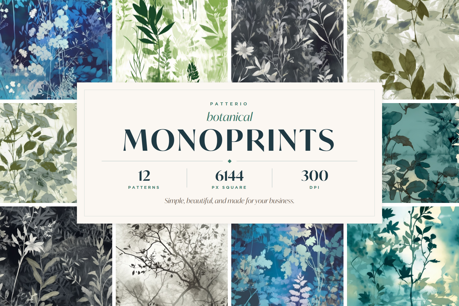
If you want a starting point built specifically for this direction, the Patterio botanical collection includes painterly, asymmetric pattern bundles in the muted earth-pigment palette this year is asking for, available in Personal, Commercial, and Extended licenses so you can match the file to the project scale.
Quick Answers for Designers Choosing Biophilic Floral Patterns
**Is biophilic floral a long-term trend or a 2026 moment?** Long-term. The trend forecasters across interior design, color strategy, and consumer search behavior are pointing in the same direction, and the cultural drivers (climate awareness, AI fatigue, post-pandemic wellness focus) are structural rather than seasonal.
**How is biophilic different from "just botanical"?** Botanical describes the subject matter (plant motifs). Biophilic describes the design intent (connection to nature through restraint, asymmetry, and earth-pigment palettes). A botanical pattern can be biophilic, heritage, ditsy, or graphic depending on how it is drawn and palette-d.
**Can I mix biophilic with other floral directions?** Carefully. Biophilic patterns work as the calming counterweight to maximalist or heritage schemes, but mixing two equally-saturated biophilic patterns in the same project usually flattens the effect. One biophilic pattern per room or product is the safe rule.
**Does biophilic work for small-brand packaging?** Yes, particularly for wellness, herbal, skincare, food, and beverage categories where the nature-led story aligns with the product. The earth-pigment palette also prints cleanly on uncoated and recycled substrates that suit small-brand budgets.
**What color should the ground be?** For 2026 specifically, soft cream, Cloud Dancer off-white, or warm stone work consistently. Pure white tends to fight the warmth of the earth-pigment palette and pulls the whole scheme toward graphic rather than biophilic.
**Is biophilic too quiet for fashion or apparel?** It is a slower direction than the maximalist patterns dominating recent apparel cycles, but it is showing up consistently in slow-fashion, sustainable, and elevated-basic brands. Match the pattern to the brand voice, not to the loudest current trend.
The Quiet Trend That Outlasts the Loud Ones
The strongest case for biophilic floral patterns in 2026 is not that they are trending. It is that they sit at the intersection of several long-term cultural shifts (climate consciousness, wellness, anti-algorithm aesthetics, post-pandemic interior priorities) that are unlikely to reverse in the next several years. Designers and brands who build pattern libraries in this direction are buying into a visual language with a long runway, not a single-season trend.
Choose patterns drawn with visible craft. Commit to the earth-pigment palette and stay inside it. Treat biophilic as the calming move in a project, not the dominant one. The result is design work that reads as considered and grounded in a year defined by quiet rather than noise.
When you are ready to source the pattern files, the Patterio botanical collection is built for this kind of work, with painterly asymmetric repeats and the muted palettes this year is asking for.
Sources cited: 1. Home Planner App, Biophilic Design in 2026 2. Style Sourcebook, Inside the Biophilic Interior: Design Trends Defining 2026 3. Designers Circle HQ, Why Biophilic Design Will Be Big in 2026 4. Modulyss, Biophilic Design: The Natural Trend Transforming Spaces and Lives 5. Pinterest Newsroom, Pinterest Predicts 2026 6. Smithsonian Magazine, Pantone Color of the Year (Mocha Mousse and Cloud Dancer announcement context)
Ready to start?
Browse seamless pattern bundles