Guide
Coastal Botanical Patterns: A 2026 Designer's Guide to Marine Flora in Surface Design
# Coastal Botanical Patterns: A 2026 Designer's Guide to Marine Flora in Surface Design Coastal design spent two decades stuck in a costume. Rope, anchors, distressed oars, a stencilled seagull. It sold, and then it stopped selling, because none of it was ever about the coast. It was about a mood board of the coast. What has replaced it in 2026 is quieter and considerably harder to fake. Designers are reaching for the actual flora of the shoreline: kelp fronds, bladderwrack, sea grass, dune thistle, samphire, coral structure. Marine botany, in other words. It carries the calm that clients want from a coastal room, but it behaves like a botanical print, which means it scales, repeats and layers the way serious surface design needs to. This guide covers where the trend comes from, why marine botanicals work structurally where nautical motifs fail, and how to specify them properly across wallpaper, fabric, packaging and stationery.
Why nautical died and botanical took its place
The shift is documented across the 2026 coastal reporting. Homes & Gardens frames the brief plainly in its survey of coastal decor ideas that read as chic rather than cliche, where the recurring advice is to suggest the sea through material, light and form instead of literal iconography. Forbes, covering the 2026 summer design and decor season, places the same instinct inside a broader move toward layered, pattern-forward rooms rather than themed ones.
The practical read for a surface designer is this. A client no longer wants a room that announces the beach. They want a room that behaves like the coast: cool light, soft movement, restraint, a little salt in the air. Marine botanicals do that job because they are pattern first and reference second. A kelp repeat on a hallway wall reads as elegant line work before anyone identifies the species.
Nautical motifs never had that quality. An anchor is a symbol. It cannot be abstracted, scaled down or drenched across a room without losing meaning and gaining kitsch.
The heritage that gives the look its authority
Marine botanicals are not a 2026 invention. They have one of the most credible lineages in all of botanical illustration, and it is worth knowing because it is the strongest story you can attach to a collection.
In 1843, the English botanist Anna Atkins self published *Photographs of British Algae: Cyanotype Impressions*, the first book ever illustrated with photographic images. The Natural History Museum's account of Atkins and her cyanotypes notes that she made every print herself, and that the captions were photographic facsimiles of her own handwriting, with some lettering appearing to be formed from delicate strands of seaweed.
The plates themselves are extraordinary as compositions, not merely as records. The Public Domain Review's collection of the cyanotypes of British algae shows how she arranged specimens with a designer's eye for negative space long before anything like surface design existed as a discipline. The full run is browsable at high resolution through the New York Public Library's digitised copy of Photographs of British Algae, which is a better reference library than any trend board.
Study those plates and you will notice the thing that makes marine flora work as pattern: the silhouettes are open. Algae branch, split and taper. They leave air around themselves. That is why they tile beautifully and why they never turn into visual mud at small scale, which is the failure mode of dense floral repeats.
The 2026 coastal palette, and why blue is not optional
The palette has warmed and deepened. The reporting converges on navy and indigo over powder blue, sea foam and sage over aqua, and a base of sand, oatmeal, driftwood grey and warm cream rather than the flat optical white of the 2010s coastal room. Deep green, aged brass and dark timber sit alongside the blues rather than being excluded by them.
Blue earns its place for reasons beyond fashion. The systematic review and meta analysis on the mechanisms of impact of blue spaces on human health, published in the International Journal of Environmental Research and Public Health, finds consistent associations between exposure to blue environments and mental restoration and reduced stress. That research is about real water, not wallpaper, and it should not be overstated. But it explains the durable client instinct that a blue room feels like somewhere you can breathe out, and it gives you something more substantial than taste to say when a client asks why the scheme leans blue.
Three palettes that hold up in 2026:
Indigo on bone. The Atkins register. High contrast, graphic, works at any scale, reads as heritage rather than beachy.
Sea foam and sand. Low contrast, restorative, ideal for bedrooms and nursery adjacent spaces where pattern should recede.
Deep green with brass warm neutrals. Coastal noir. Reads as a study or dining room, not a holiday let.
Scale: the decision that makes or breaks the repeat
Marine botanicals give you an unusually wide scale range, so the discipline is in choosing, not in hoping.
Large scale, roughly a 60cm to 90cm repeat, treats a single kelp or laminaria form almost as a mural. This is the statement wall application, and it is where the 2026 wallpaper appetite is concentrated.
Mid scale, a 20cm to 35cm repeat, is the workhorse for upholstery, roman blinds and headboards. Keep the ground open. Marine forms crowd faster than florals because the fronds have reach.
Small scale, under 10cm, is the packaging, stationery and lining application. Here you want the abstracted texture of a frond rather than the identifiable plant, essentially a coastal answer to the ditsy floral. Our guide to ditsy floral patterns for fabric covers the scale mathematics in more detail, and it transfers directly.
The single most common mistake is running one scale across an entire scheme. Pair a large kelp wall with a small textural sea grass on the cushions and the room reads as designed rather than wallpapered.
Where coastal botanicals earn their keep commercially
Wallpaper is the obvious application, and demand for it is running unusually hot in 2026, but it is not the highest margin use of a coastal botanical set.
Packaging is. Skincare, sea salt, candle, soap and coastal food brands are all reaching for marine botany because it signals clean provenance without saying a word. A single kelp line drawing on a matte kraft box does more brand work than a paragraph of copy. If you are designing for that market, our guide to botanical patterns for product packaging walks through the print and licensing considerations.
Stationery and wedding work is the second strong lane, particularly for coastal venues, where a sea grass border replaces the expected palm or hydrangea and instantly reads as more considered.
Soft furnishings, tea towels, ceramics and print on demand round out the list. The through line is that marine botanicals flatter matte, textural and natural substrates. They look cheap on gloss. Specify accordingly.
How to avoid the four coastal cliches
Do not mix motif families. Kelp with starfish with anchors is a gift shop. Pick marine botany and stay inside it.
Do not use pure white grounds. Warm the base. Bone, shell, oatmeal, pale sand. White grounds are what date the 2015 coastal room.
Do not centre the specimen. Atkins never did. Off centre placement with generous negative space is what separates botanical composition from clip art.
Do not over saturate the blue. The 2026 blues are inky or dusty. Anything approaching a bright cyan will pull the whole scheme toward a swimming pool.
Licensing before you specify
If a coastal botanical set is going onto product you sell, the licence matters more than the file. A personal licence covers your own home and portfolio. A commercial licence covers goods you sell up to a stated unit ceiling. An extended licence covers manufacturing at volume and resale into retail.
Get this right before the first print run, not after. Our guide to seamless patterns for small business commercial use sets out how the three tiers actually work and which one your production run needs.
Where to start
Coastal botanicals reward designers who treat them as botany rather than as a theme. Study the structure, respect the negative space, warm the ground, choose one scale to lead and let the rest support it. Do that and you get a room, a package or a card that feels like the coast without ever having to mention it.
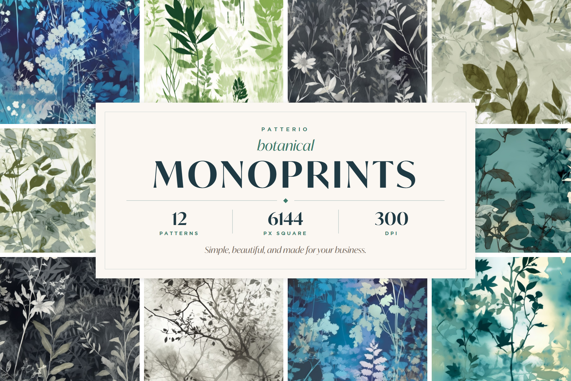
Patterio's botanical sets are built for exactly this kind of work: open silhouettes, soft painterly edges, seamless tiles that hold at both mural and ditsy scale, and clear three tier licensing so you know what you can sell before you print.
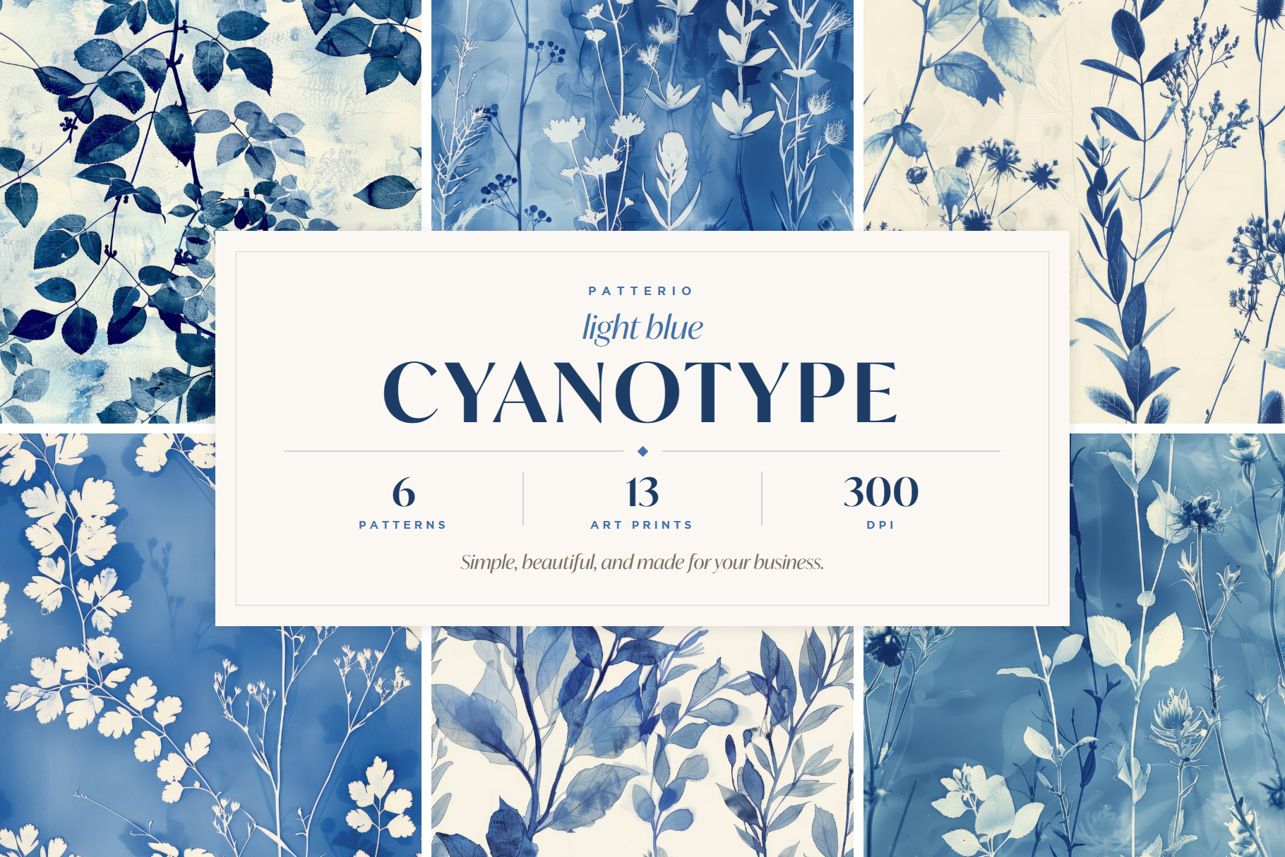
Browse the botanical collection to start a coastal scheme, or explore the cyanotype sets if you want the deep indigo register that runs straight back to Atkins. For more on that blue, read our guide to cyanotype patterns for home decor.
Ready to start?
Browse seamless pattern bundles