Guide
Art Nouveau Floral Patterns: A 2026 Designer's Guide to the Whiplash Revival
# Art Nouveau Floral Patterns: A 2026 Designer's Guide to the Whiplash Revival Art Nouveau is the one historical style that surface designers keep circling back to and keep getting slightly wrong. It is not simply "curvy Victorian." It was a specific, disciplined attempt to build a new ornamental language out of botany, and its floral vocabulary was engineered around growth, movement and structural line rather than around pretty blooms. That distinction matters commercially right now, because the style is back in a serious way. After a decade in which minimal interiors made ornament feel indulgent, 2026 buyers are actively seeking pattern with personality. Art Nouveau florals sit in an unusually strong position: they read as heritage and as luxury at the same time, and they carry enough graphic structure to survive scaling down onto packaging, stationery and fabric. This guide covers what actually defines an Art Nouveau floral, how the 2026 revival differs from previous ones, and the practical decisions that separate a convincing set from a costume version.
What Art Nouveau florals actually are
The movement ran roughly from the 1880s to the outbreak of the First World War, and it was international from the start. The Metropolitan Museum of Art notes that its sinuous lines and "whiplash" curves were derived in part from botanical studies and illustrations of deep-sea organisms, including Ernst Haeckel's *Kunstformen der Natur* of 1899. That origin story explains a lot. These are not decorative flowers copied from a garden. They are structural studies of how a plant grows, abstracted into line.
The style also travelled under different names in different markets: Jugendstil in Germany, Sezessionstil in Austria, Modernisme in Spain, Stile Liberty in Italy. Each region tuned the vocabulary differently, which is useful for a designer because it gives you several distinct directions rather than one generic look.
The practical takeaway is that an Art Nouveau floral is defined by line quality first and by flower choice second. If the line does not have tension and direction, adding an iris or a poppy will not rescue it.
The 2026 revival, and why it is different
The current wave is not a straight reproduction. VISI reported in March 2026 that "swirling lines, whimsical florals and golden flourishes have been reimagined, with AI and 3D-driven design giving the century-old Art Nouveau style a sleek new twist", describing a revival that is "confident, not coy." That phrase is worth holding onto. The 2026 version is bolder, cleaner in its execution, and far more willing to strip back the fussier late-period excess.
The trend also sits inside a broader move toward density. Pattern Weaver's 2026 surface trend report places Art Nouveau alongside chinoiserie and Baroque as one of the complex, layered styles that maximalism is currently well served by, while noting that successful maximalist patterns control their complexity through colour cohesion rather than through restraint of motif. That is the single most useful technical note in the whole revival: a pattern can carry forty elements as long as it carries only five colours.
Motif vocabulary that reads as authentic
Certain plants recur across original Art Nouveau work because they suit the line. Iris, poppy, wisteria, honeysuckle, lily, thistle, waterlily and trailing vine all offer either a long stem that can be bent into a whiplash curve or a petal shape that flattens well into silhouette.
Avoid the round, symmetrical, front-facing bloom. A rose viewed head-on has no direction, and direction is the whole point. Where roses do appear in the period, they are usually seen in profile or reduced to the tight geometric bud that Charles Rennie Mackintosh and the Glasgow School used repeatedly.
Insects and birds belong in the vocabulary too. Dragonflies, peacocks and moths appear constantly in original work because their wings gave designers another excuse for iridescence and elongated line. Used sparingly, one dragonfly per repeat rather than five, they signal the style instantly.
Scale, repeat and the Morris lesson
Art Nouveau grew directly out of the British Arts and Crafts movement, and William Morris is the cautionary tale worth studying before you commit to a repeat size. The V&A's account of his wallpaper work quotes a contemporary critic in 1892 complaining that Morris's patterns were "palatial in scale" and that "the magnitude of the designs exclude them from ordinary work". Morris himself believed large patterns suited small rooms. The market disagreed, and it cost him sales.
The same tension exists now. Large-scale Art Nouveau florals photograph beautifully and sell hard on Pinterest, but a 127cm vertical repeat is unusable on a greetings card or a candle label. If you are licensing a set for mixed use, build two scales of the same design rather than hoping one will stretch. A 60cm to 90cm repeat handles wallpaper and upholstery. A 15cm to 20cm repeat handles stationery, packaging and small textile goods.
The V&A article also records Morris warning designers against making a paper look like a literal transcription of nature. That advice holds. Flatten. Stylise. Let the line do the describing.
Palette discipline
Original Art Nouveau palettes were muted and slightly earthy rather than jewel-bright. Olive, moss, ochre, oxblood, dusty mauve, teal, aged gold, warm cream. The metallic accent, when it appears, is a soft brushed gold rather than a bright chrome yellow.
Pattern Weaver's report notes that 2026 colour forecasting is dominated by mineral and clay tones, terracotta, sand, olive, slate and iron oxide red, all chosen because they read as coming from a natural material. That happens to overlap almost exactly with the historical Art Nouveau range, which is part of why the revival feels current rather than nostalgic.
Practical rule: cap the palette at five colours, and make one of them a near-neutral ground. Contrast should come from value, not from saturation. A design that relies on bright contrast will look like a poster reproduction rather than a surface pattern.
Where these patterns sell
Three categories are performing particularly well.
Wallpaper and feature walls remain the obvious home, especially in hallways, powder rooms and behind headboards where a dense pattern gets a defined boundary. If you are pairing Art Nouveau with other pattern in the same room, the layering principles in our guide to pattern drenching with florals apply directly.
Premium packaging is the fastest-growing use. Small beauty, fragrance and tea brands want ornament that signals craft heritage without looking twee, and an Art Nouveau border with integrated lettering does exactly that job on a box or label.
Stationery and wedding suites are the third. The style's built-in frames and borders suit invitation layouts far better than an all-over floral does, and the elongated vertical format of a menu or place card is a natural fit for a whiplash stem.
Common mistakes to avoid
Over-symmetry is the most frequent error. Art Nouveau compositions are balanced but rarely mirrored. A perfectly symmetrical layout tips the design toward Art Deco, which is a related but distinctly different discipline, covered in our guide to Art Deco floral patterns.
Outline weight is the second. A uniform stroke around every element flattens the whole design into clip art. Original work varies line weight constantly, thickening at the base of a stem and tapering to almost nothing at the tip. If your set has uniform outlines, it will read as generic.
The third is background neglect. In strong Art Nouveau work the foreground and background are closely interwoven, with secondary foliage filling the space between the primary blooms. Leaving flat empty ground between motifs produces a scattered, modern look that fights the style.
Building a room or a range around them
Because Art Nouveau florals are visually loud, they need a quiet supporting cast. Pair one dense floral with two or three companion patterns that share the palette but drop the complexity: a fine stripe, a tonal texture, a small-scale geometric derived from the same line vocabulary. This is how period interiors actually worked, and it is how a commercial pattern collection should be structured if you want buyers to purchase the whole set rather than one file.
For interiors, treat the floral as the anchor and let everything else recede. For product ranges, use the floral on the outer packaging and the companion textures on the inner materials, tissue, sleeves and secondary labels.
Start with the right set
Art Nouveau rewards designers who commit. Half measures, a few curves and a token iris, read as vague vintage rather than as a deliberate style choice. The sets that work have consistent line tension, a disciplined five-colour palette, and enough secondary foliage to hold the ground together.
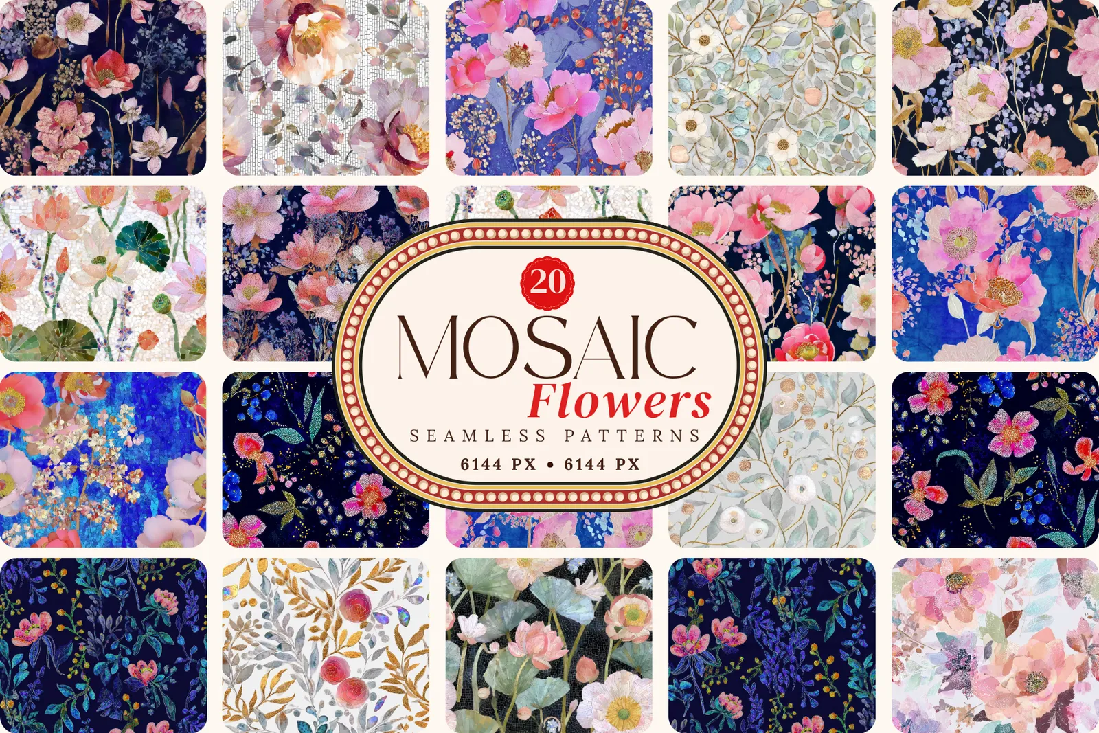
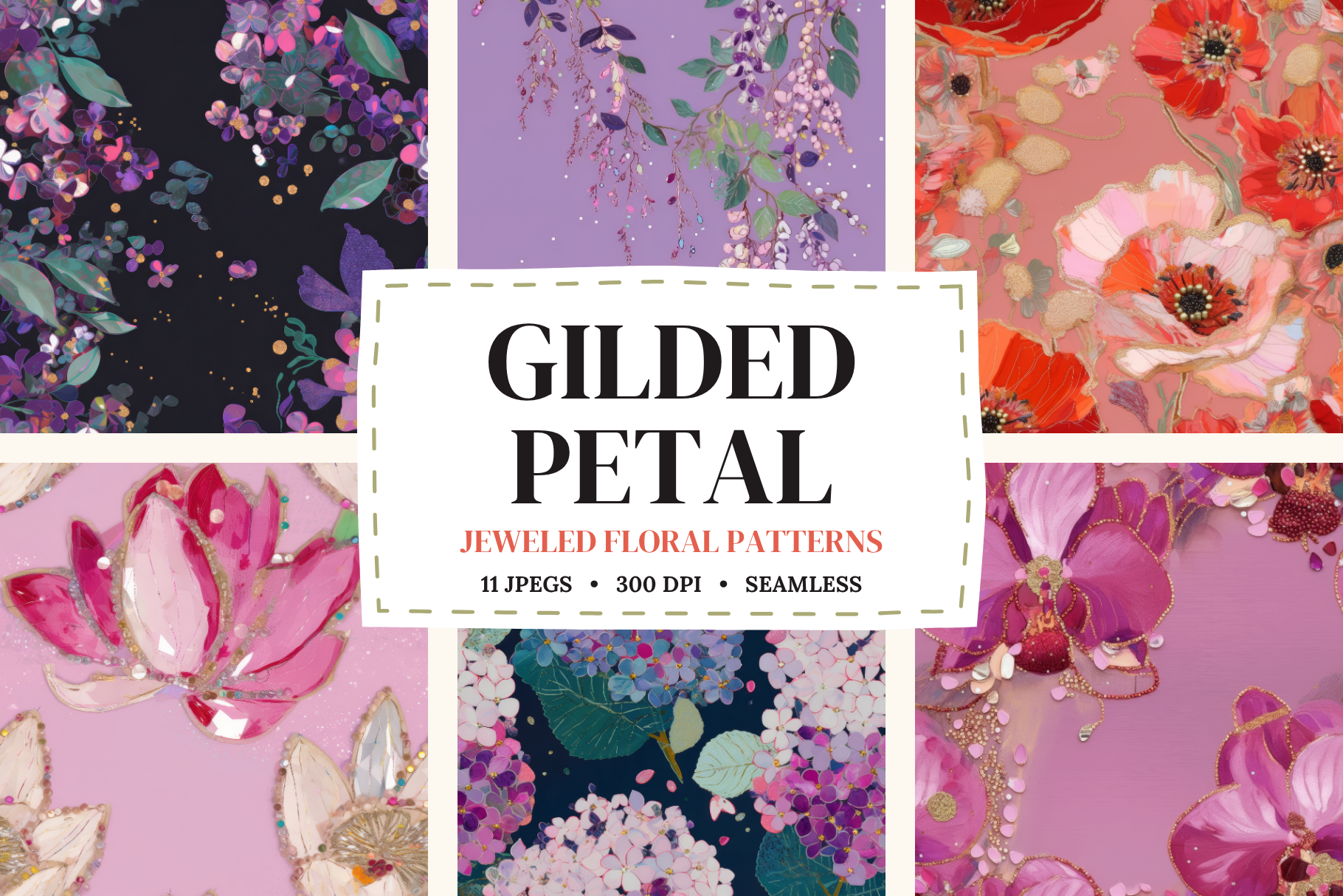
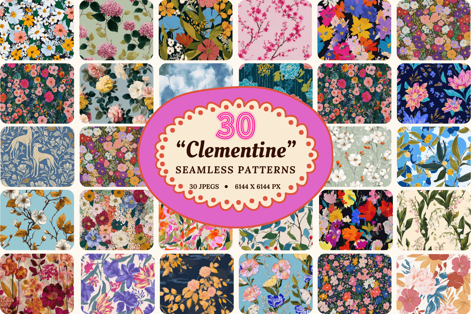
Patterio's floral collections are built with that discipline in mind: painterly, seamless, and supplied at resolutions that hold up whether you are printing a 90cm wallpaper repeat or a 20cm label. Browse the floral pattern sets to find a foundation, then look at the vintage collections for the heritage-leaning companions that make a full range work.
Ready to start?
Browse seamless pattern bundles